Thankyou for taking the time to browse our site, please fill in your contact details below with a brief message and we will get straight back to you.
Alternatively you can email us at
mark@spacemanbrand.com
or call 07768 511 710



Spaceman designed, fabricated and installed a wayfinding, signage and branding solution for Sky’s Campus. Creating an identity to continue throughout the whole property portfolio that has recognisable common principles yet completely bespoke to fit each location.
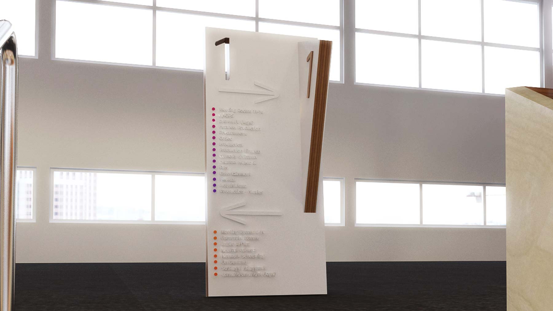
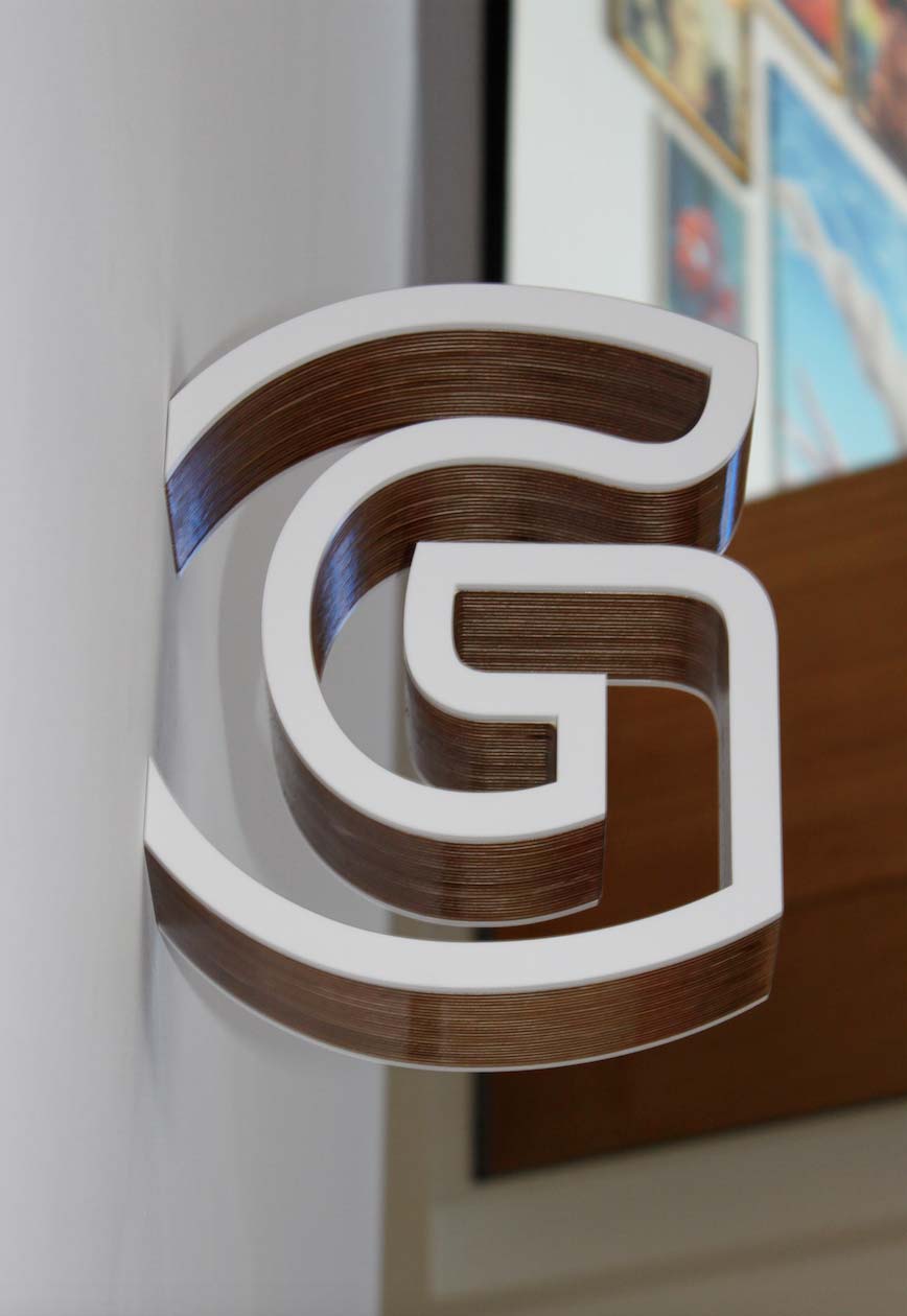
We based our design on the glass logo. Mirroring and magnifying its surroundings as used in their marketing over images and backgrounds and the sky colour spectrum as a location and destination aid.
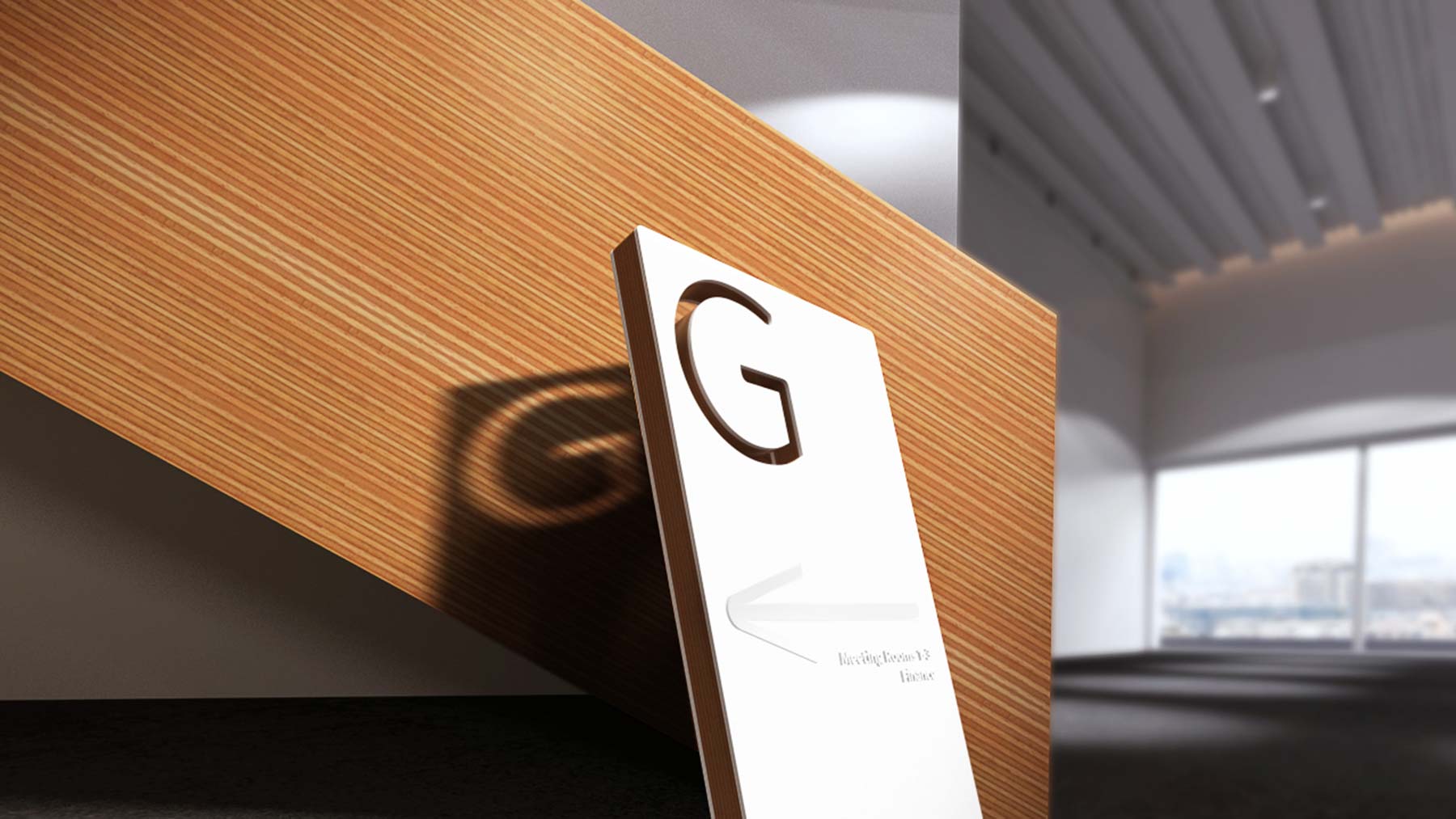
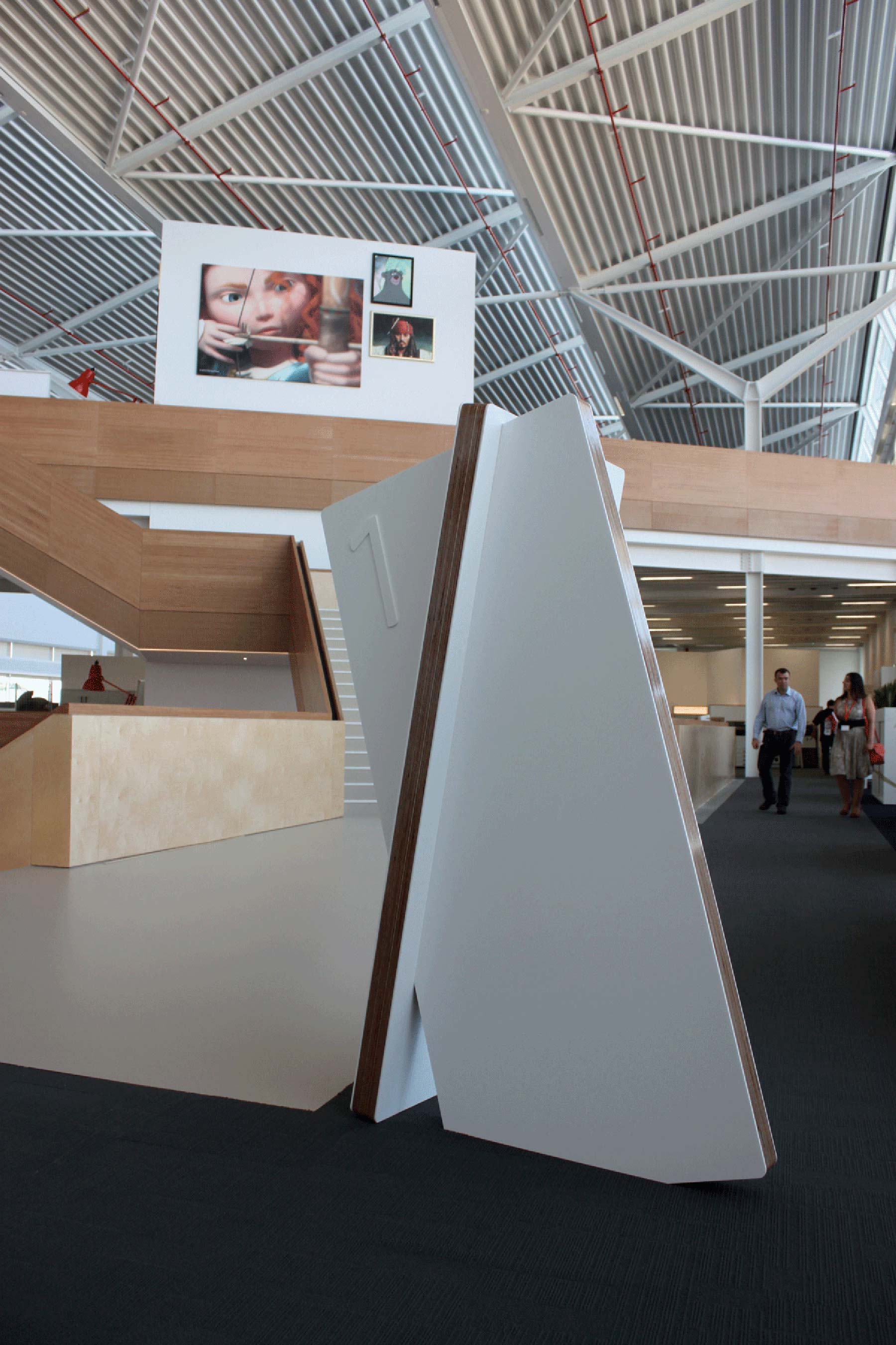
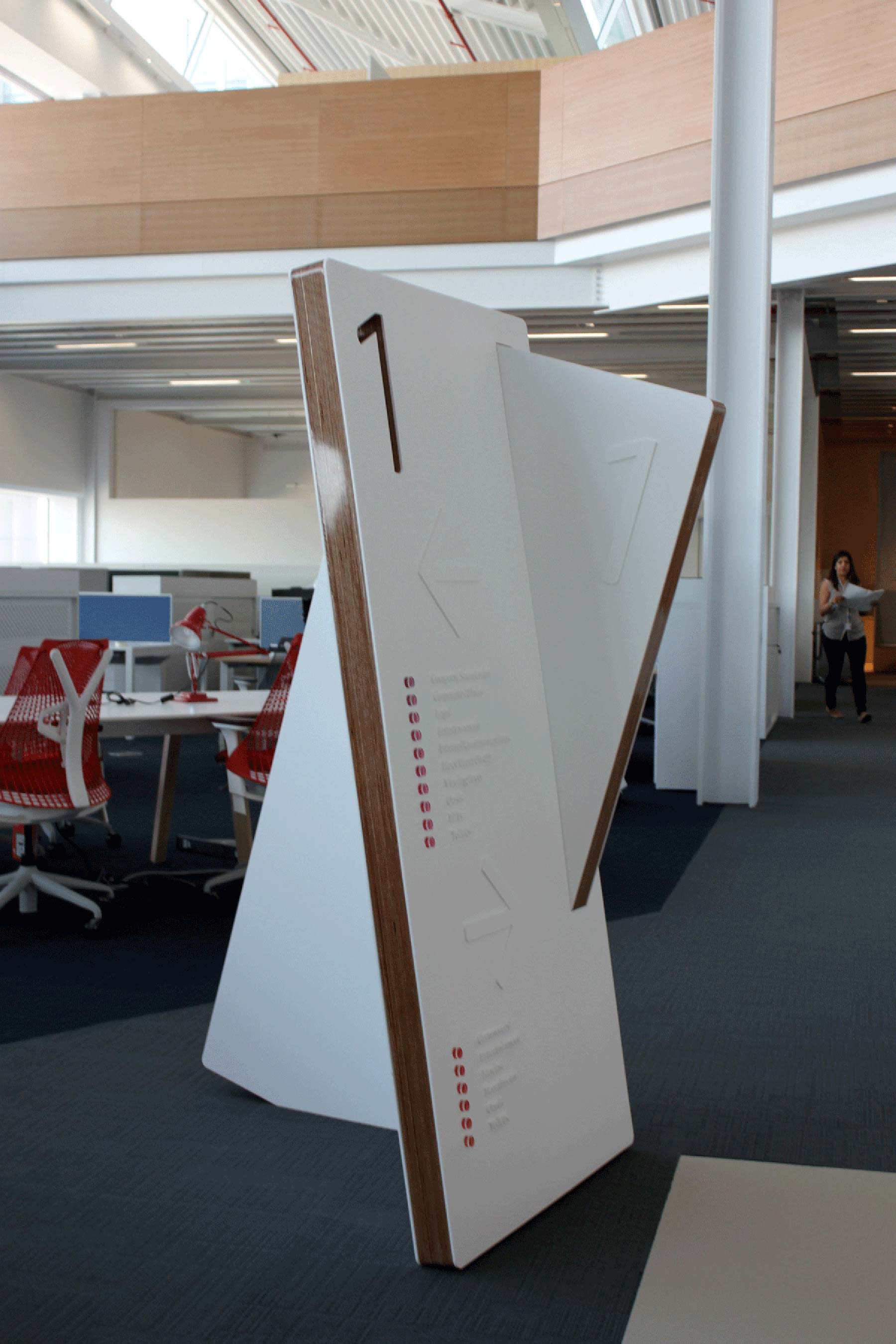
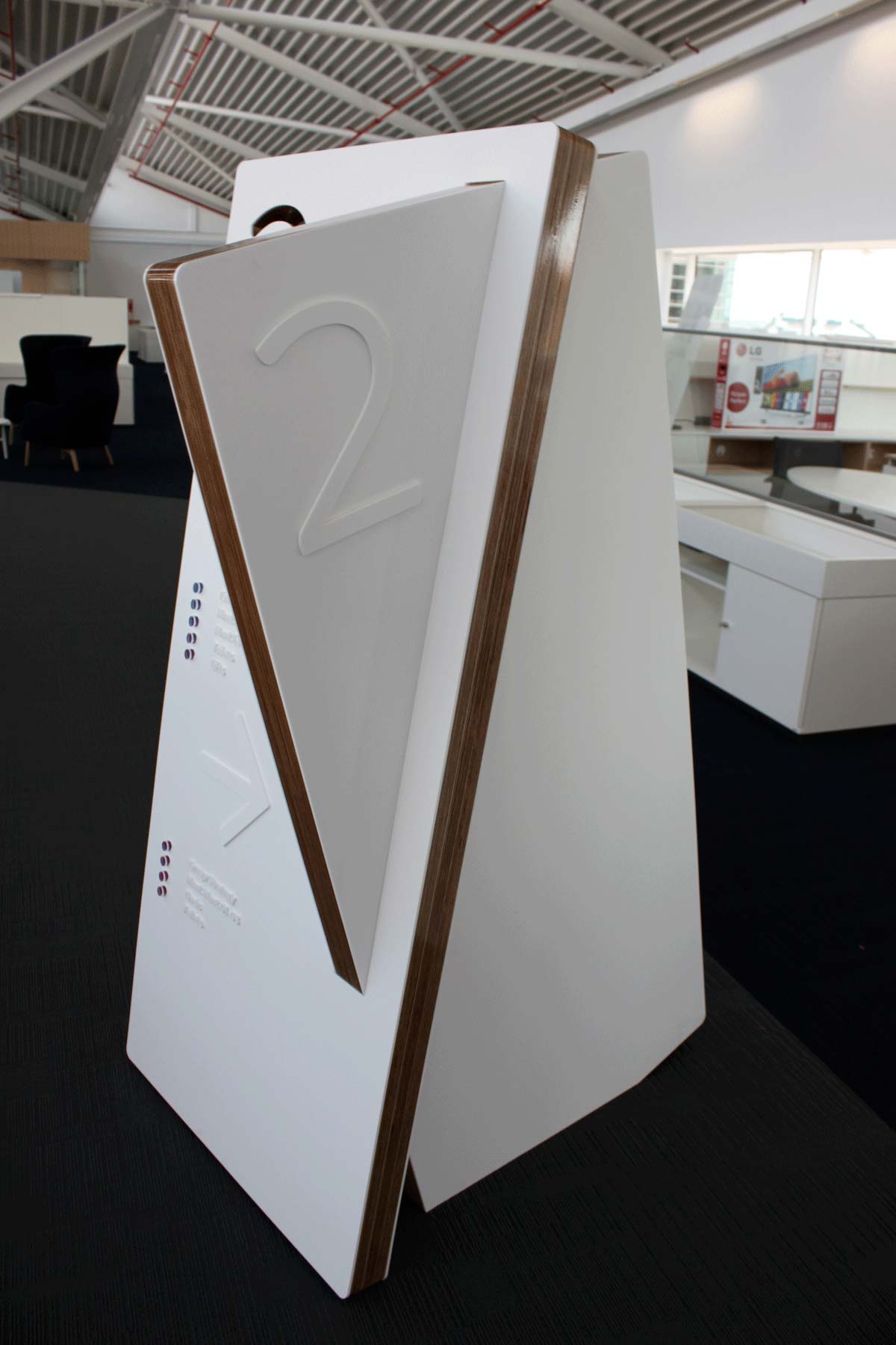
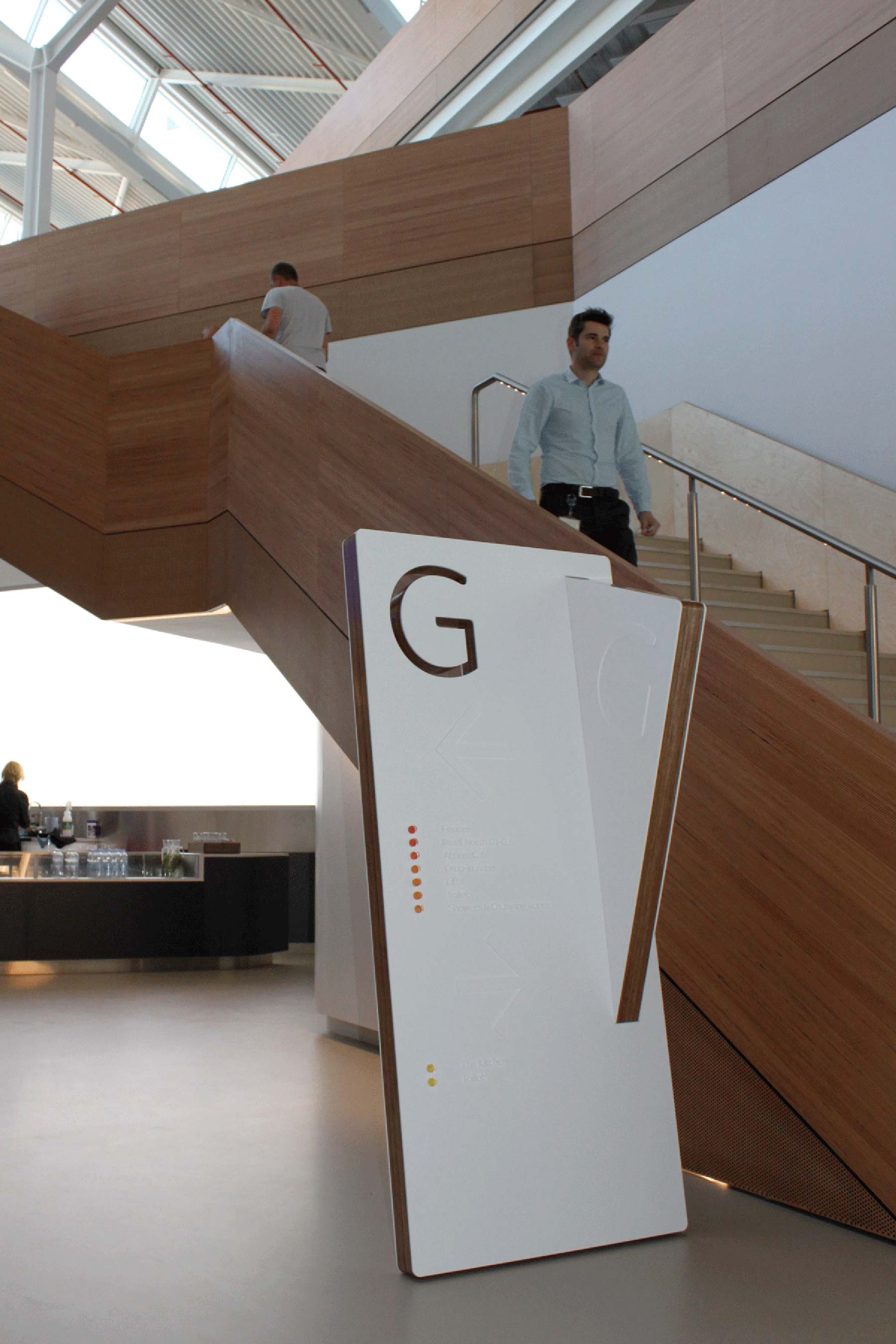
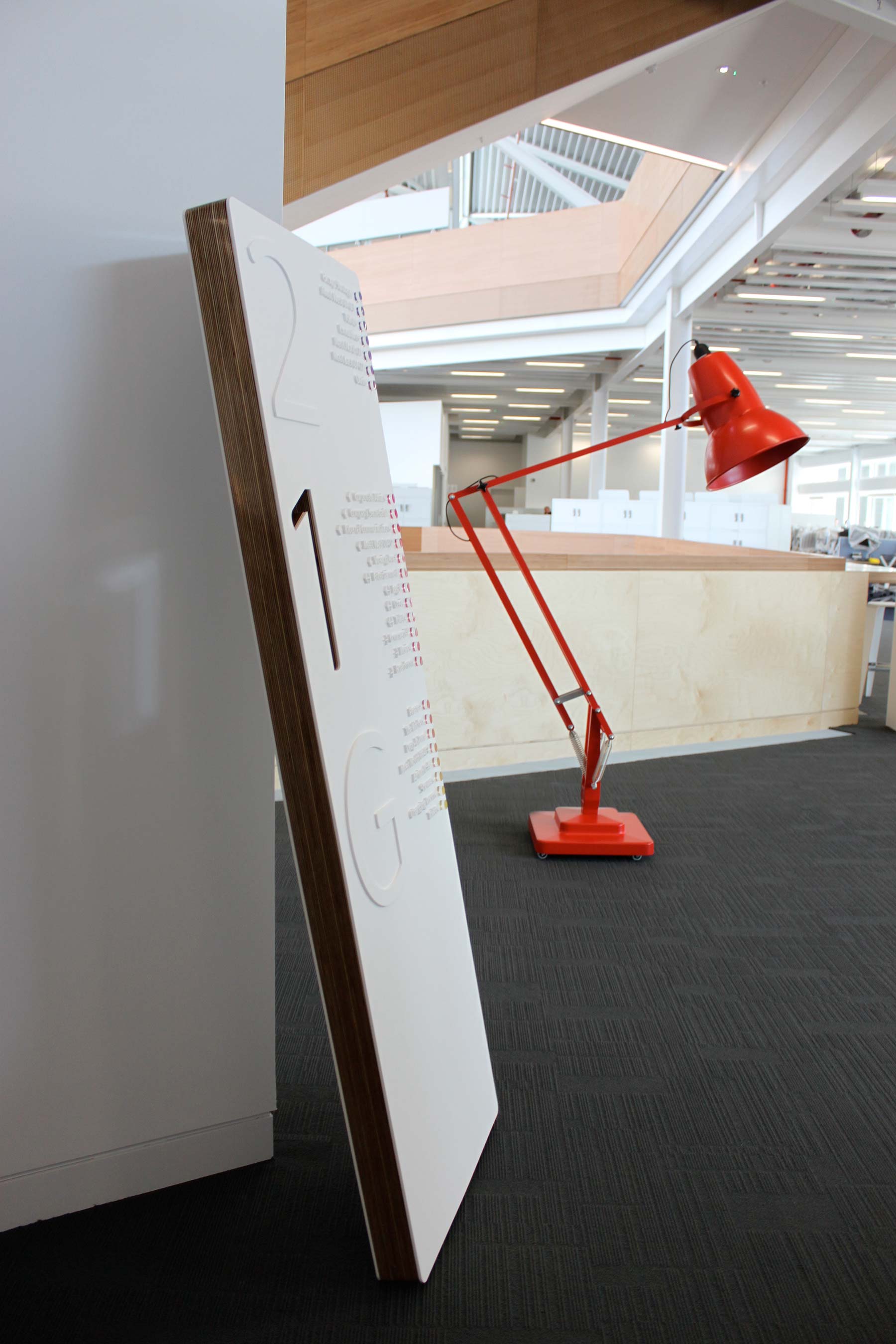
Firstly for the Hub we wanted Totems and Plynth directories to mirror materials from the build, to appear as part of the architecture and fabric of the space, using angles of the dramatic stairwells and utilising the movement of light and shadow from the huge expanse of glass that make up the buildings top floor that changes throughout the day with the 360 degree glazing.
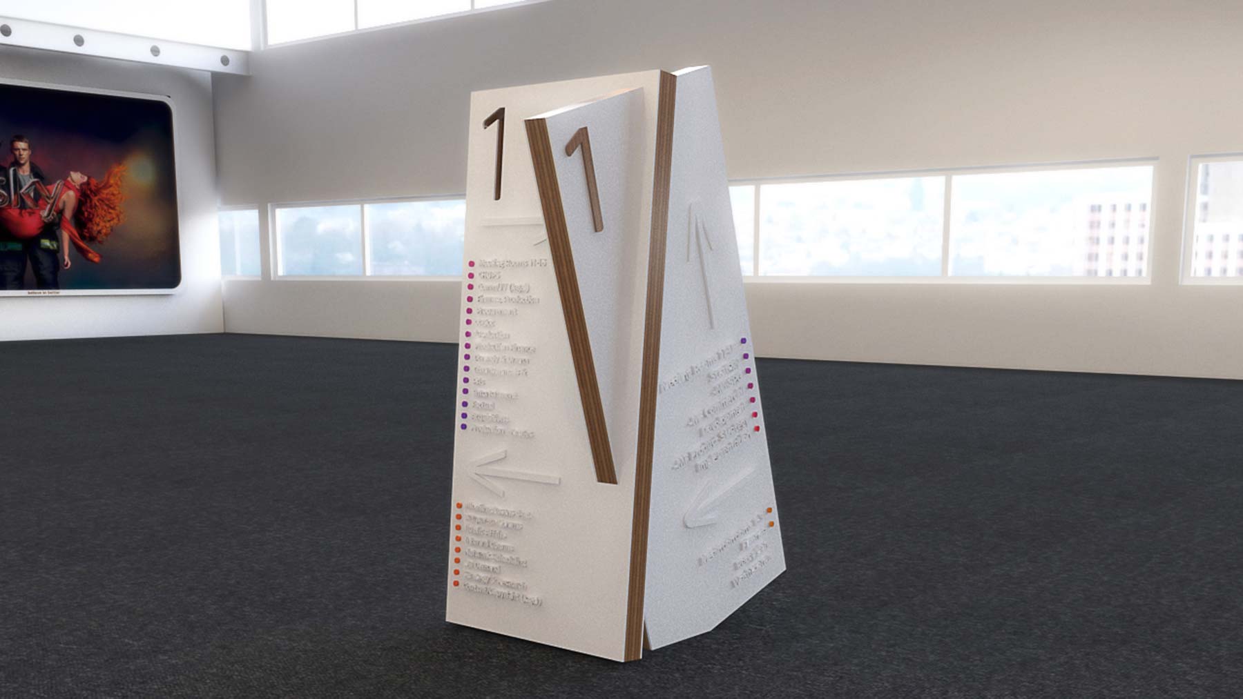
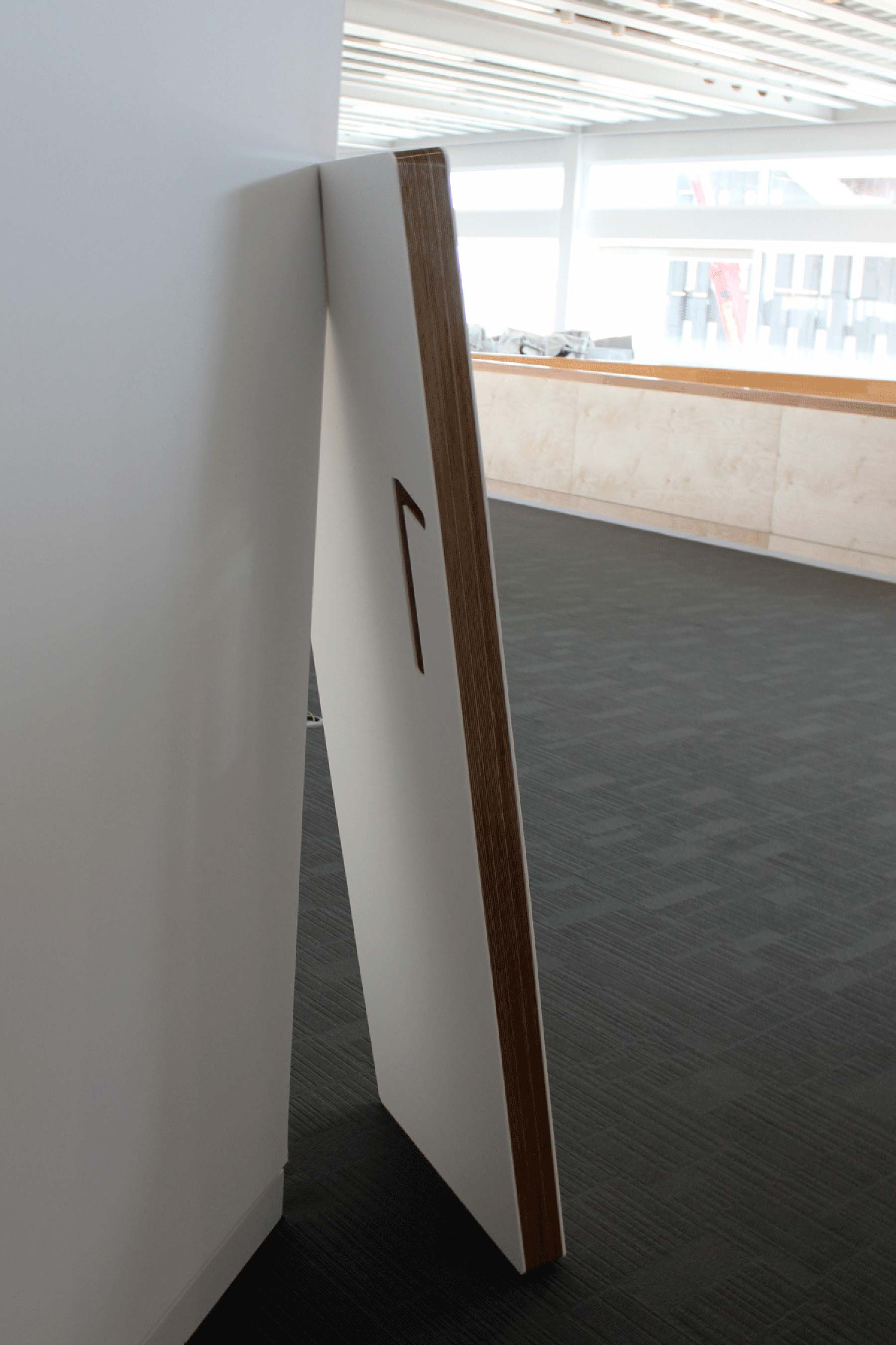
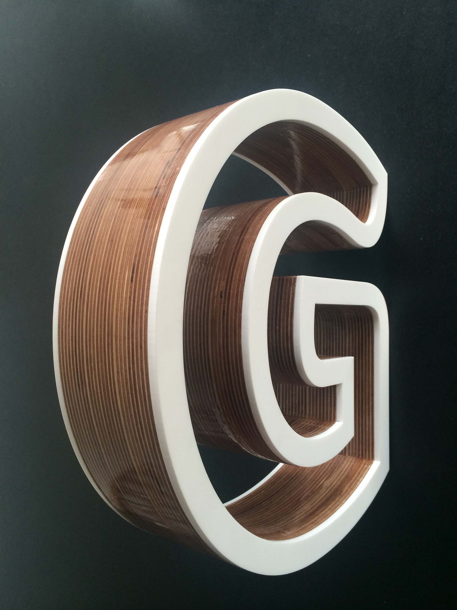
100mm thick slabs were constructed by building up layers of cad-cut far eastern ply. These were designed so that complete stability and balance are achieved when two are joined together appearing to be leaning on and through each other and sunk into the building itself. The wood was then given 15 coats of lacquer to achieve the highest of gloss finishes to contrast the matt white composite on the face and rear of each plinth.
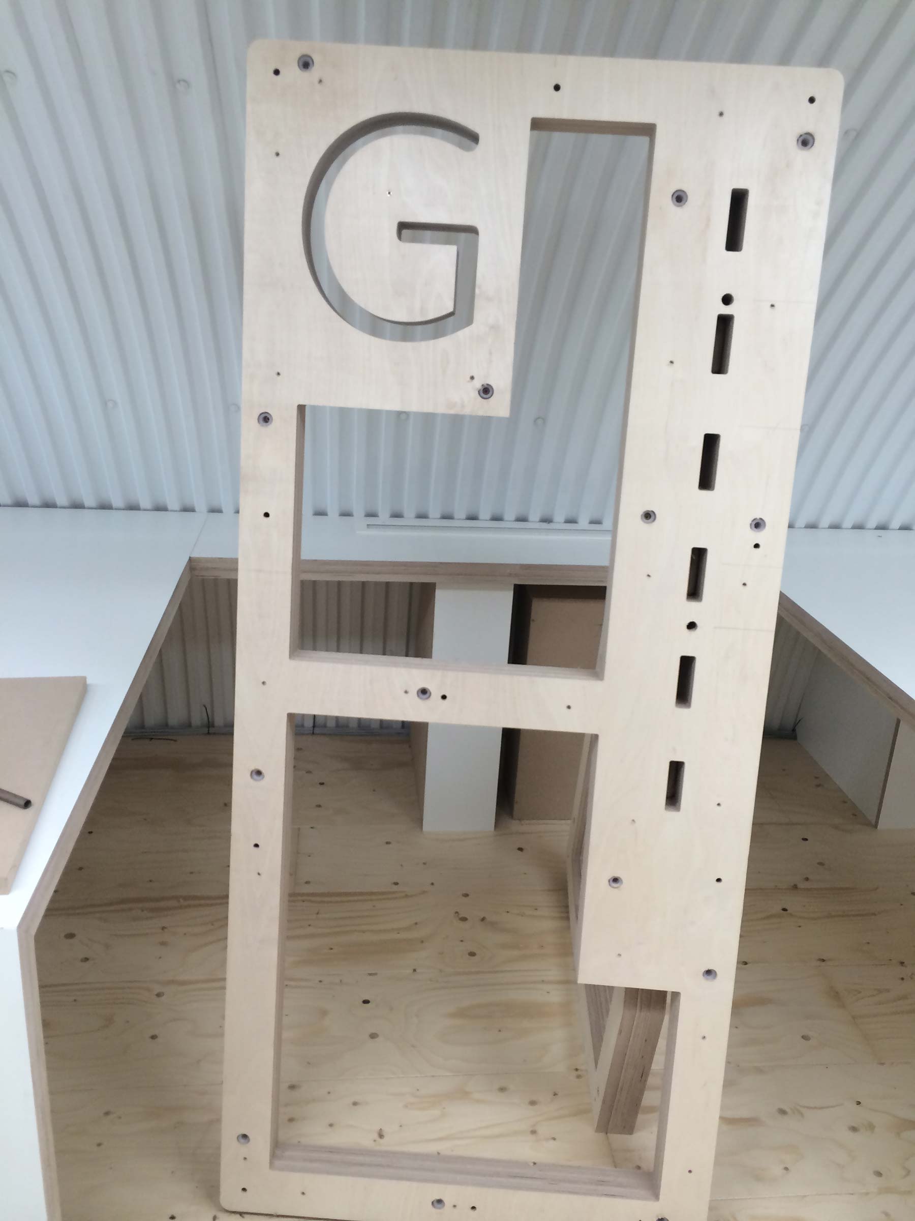
The ‘cut outs’ for the numbers allow light through to create the moving shadow. Making it seem that these are cut through a solid block of high gloss ply is a detail that we are very proud of. The construction of the lift lobby ‘leaning’ plinths were designed and fabricated with the prism shape of the wall corner and the bottom rear edge taken out from the ply and composite so that a free standing structure appears to sink into the fabric of the building and is fixed in place simply with its own weight. The time spent and difficulty of doing this may not be noticed by all. These are the things that are most important.
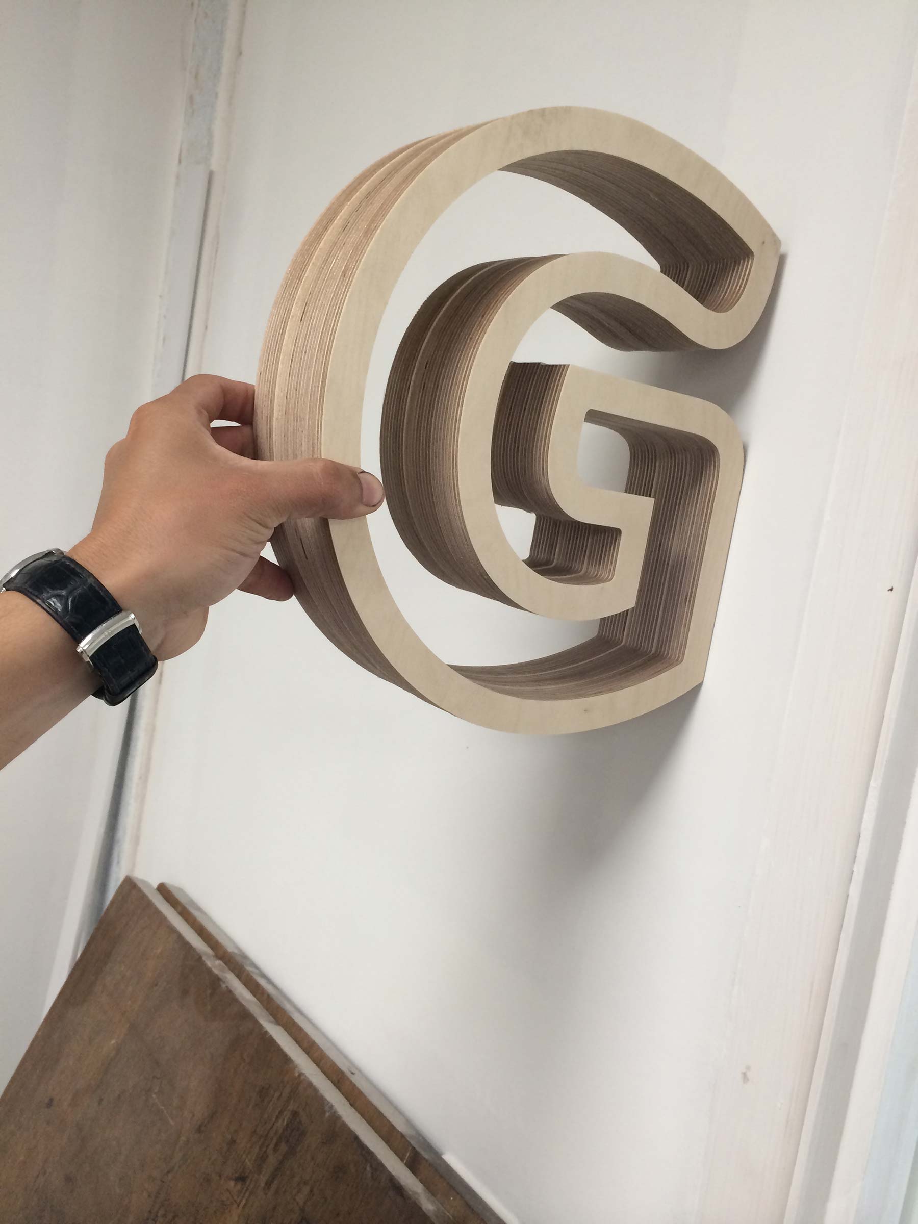
Our renders and photographs of the finished project show how accurately our designs are produced. Working with our renders to fabricate complex cad drawings so that from concept to completion the client knows exactly what will be produced.
Spaceman were also commissioned to design a wayfinding and signage solution for Sky Central, their biggest building. Creating a way of navigating throughout the 415,000 sqft landscaper. Housing 3500 staff and including a 200 seater cinema and live broadcasting studio at its heart we designed the building flow using totems, signpost direction and Landmark wayfinding.
Glass Totem installations to be viewed from all aspects of arrival to guide and simplify navigation. RGB ‘red, green and blue’ the three colours that make up light and vision and make up the sky colour gradient used as navigational guidance over three giant floors. The Claret meeting room at one end of the red floor with Rhodamine at the other. Our design intention was for the building to be named ‘Skylight’.
