Thankyou for taking the time to browse our site, please fill in your contact details below with a brief message and we will get straight back to you.
Alternatively you can email us at
mark@spacemanbrand.com
or call 07768 511 710



The ‘Believe In Better Building’ that is home to Sky Acadamy uses the same branding and signage language as the Hub.
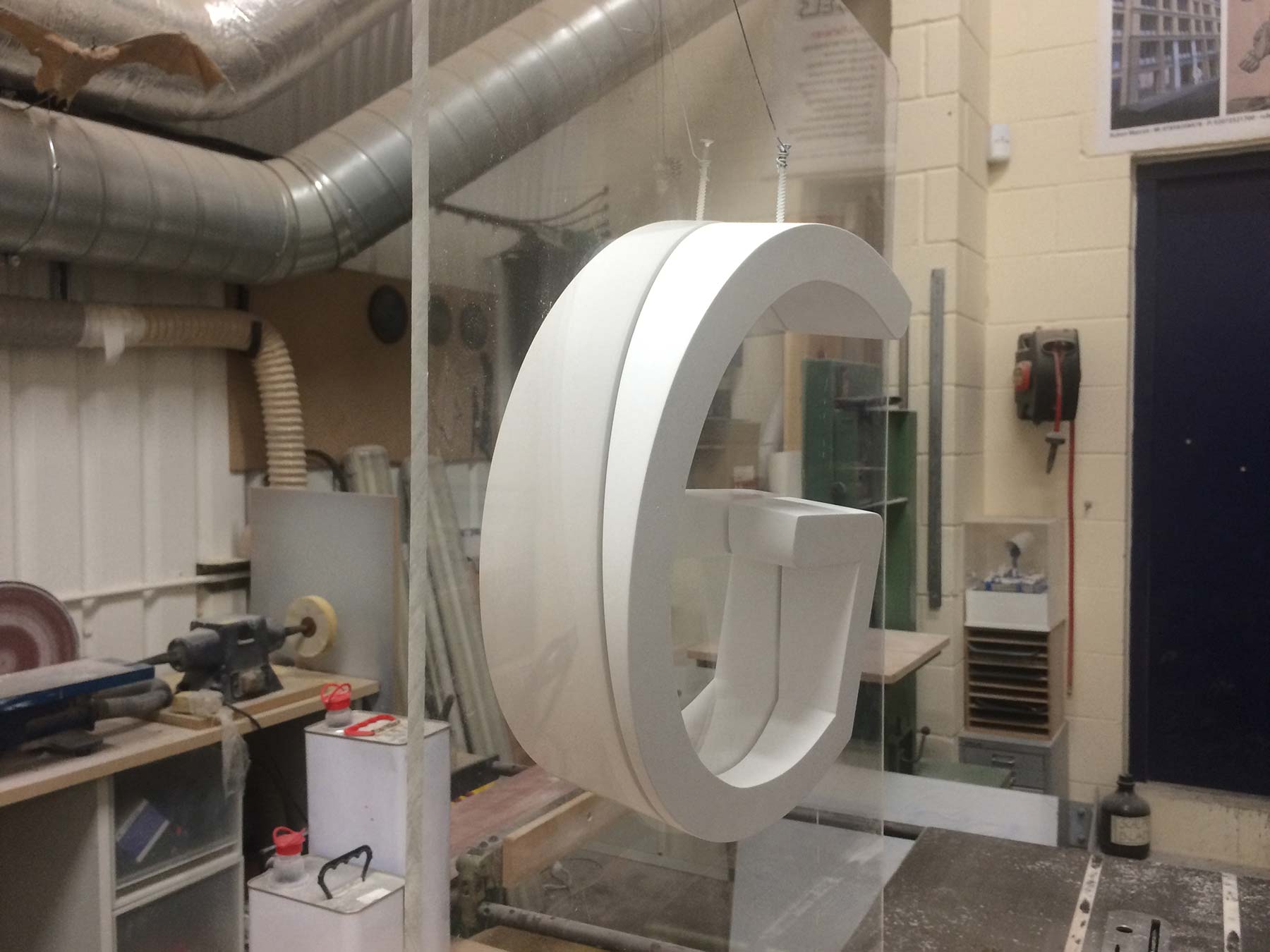
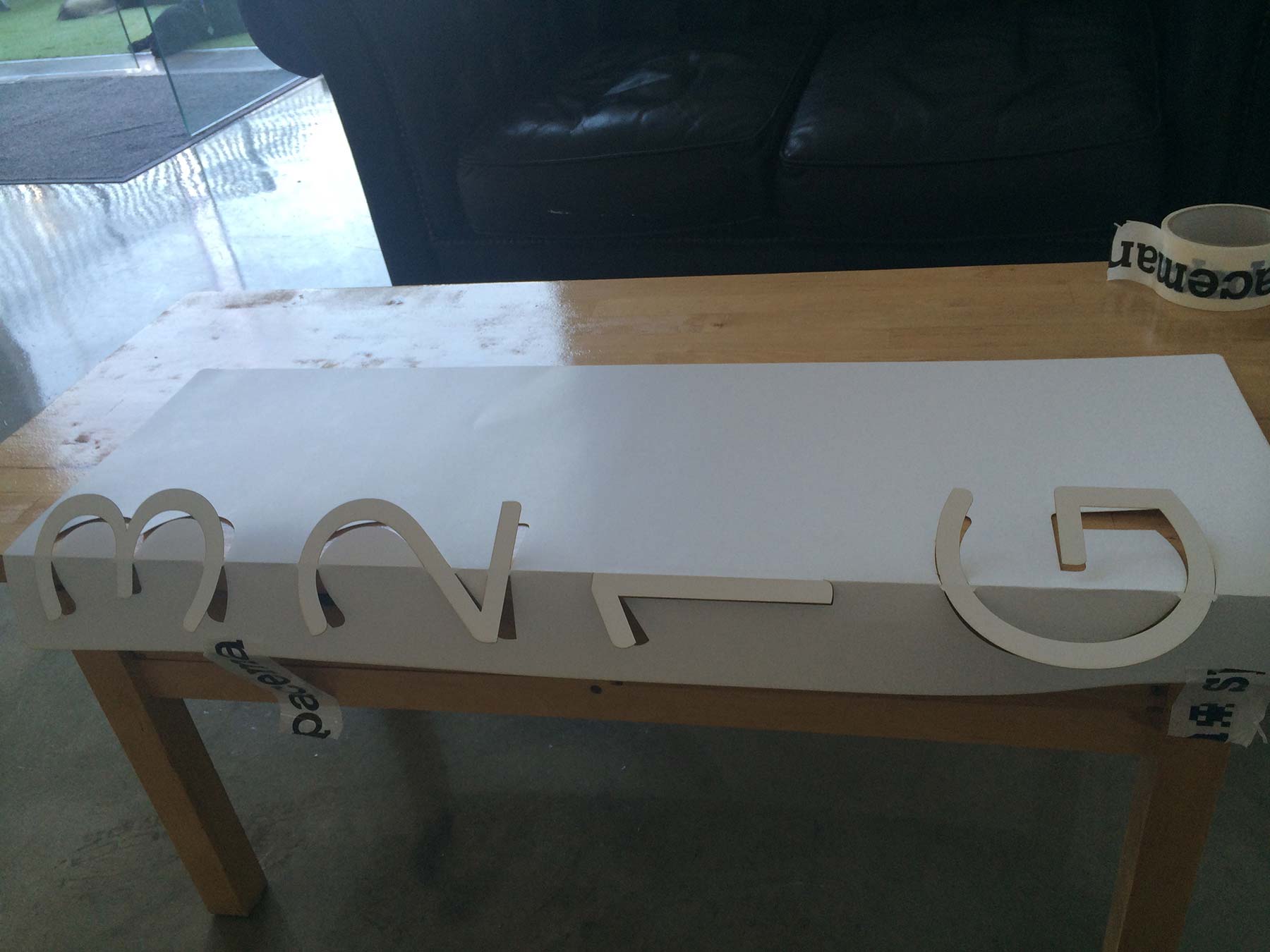
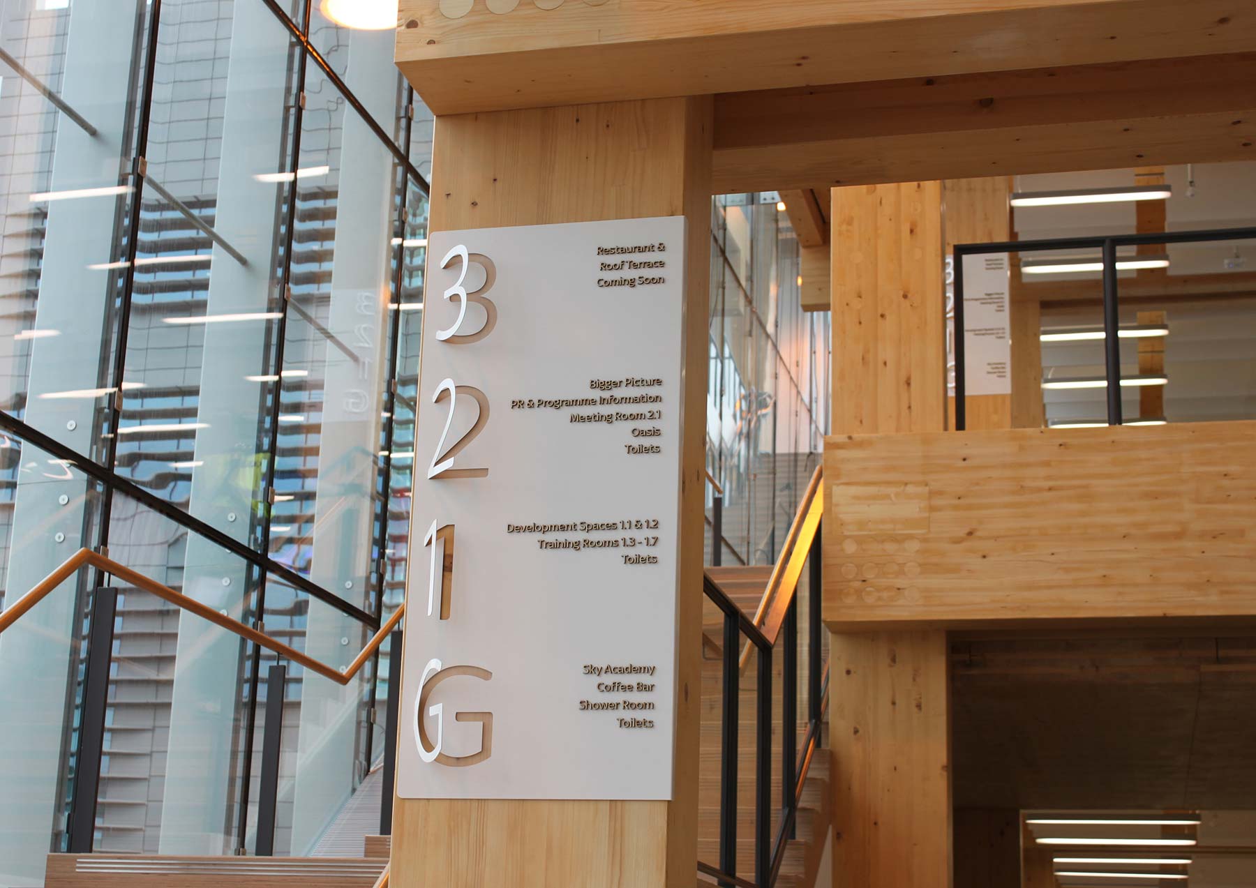
We again designed, fabricated and installed throughout the spruce and glass structure with its honest Scandinavian functionality. Its seemingly simple structure in wood with exposed pegs that hold the building together is such a clever building and to achieve this simplicity on such a scale is very impressive. We wanted to compliment the building with further seemingly simple branding through paper thin powder coated aluminium that wraps around the main giant wooden columns.
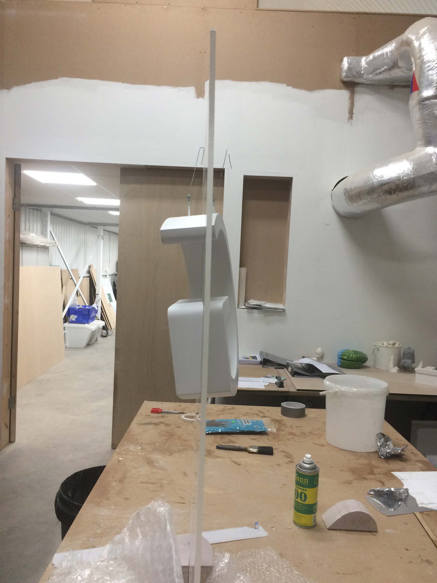
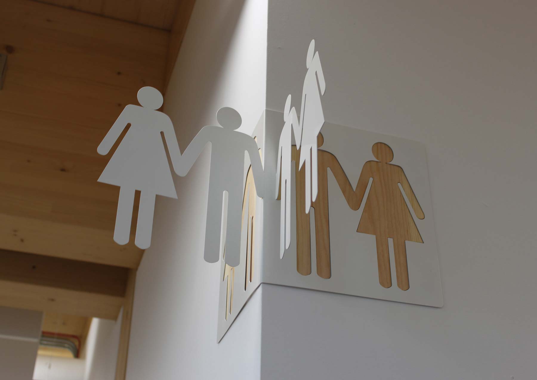
We folded and cut angles in the metal before we then powder coated to make the most of the light. The number of the floor on the directories inset with 50% opacity acrylic to knock back other floors whilst cut out revealing the wood from the columns to indicate which floor you were on. This was reversed with inset spruce numbers and symbols when on white walls. For the internal wooden stairwells we created floor numbering that appears to rise from the walls as if from the sea. Fabricated as two sections of the same number, cut on two different axis from the face.
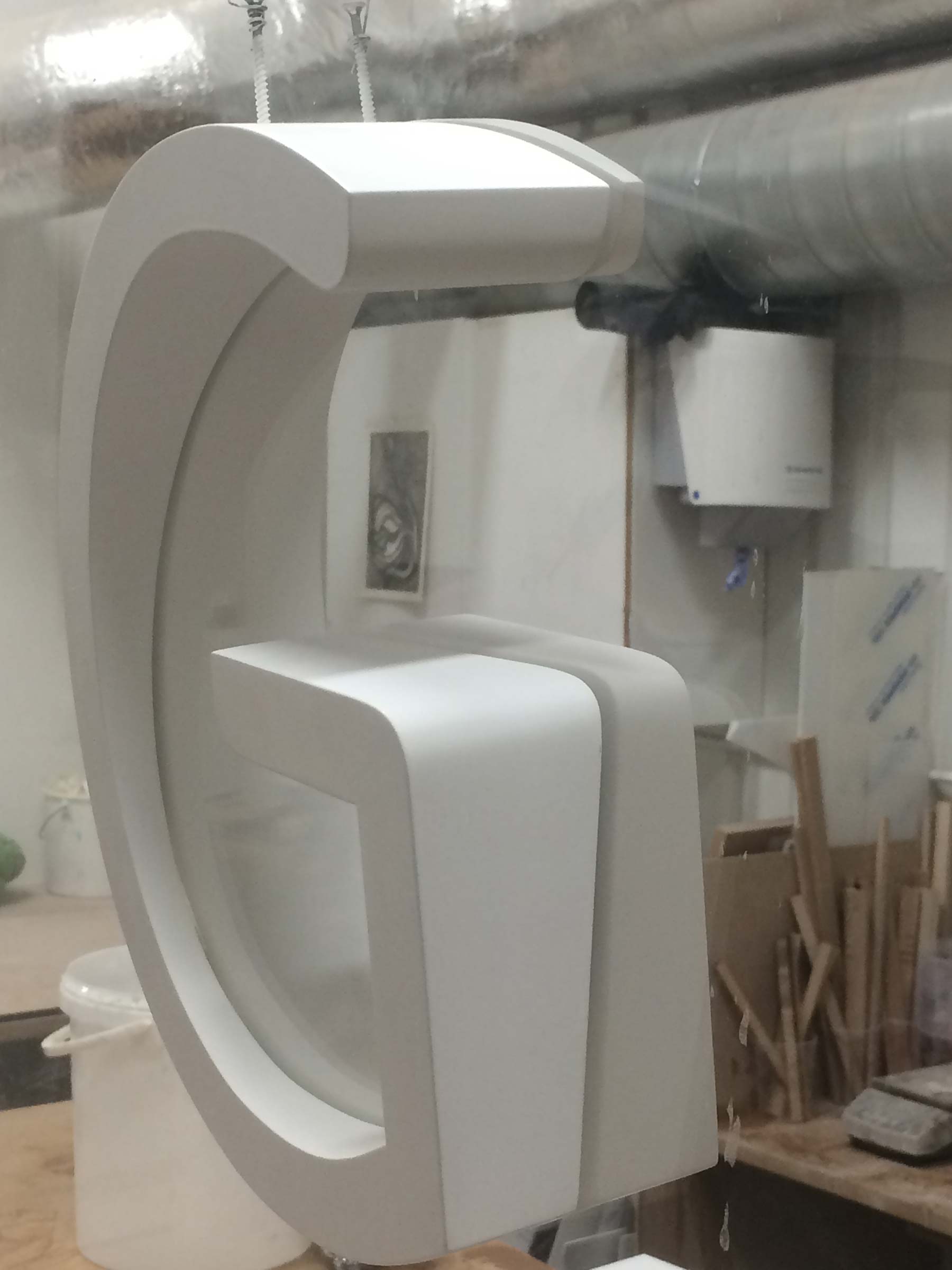
This again keeps true to the language we created and also is typical of our approach. Going further, and making a simple floor number on a wall something special that will be noticed and appreciated by both our client and their visitors.
The principle of the design is to continue outside with water flowing from within when signage is placed in water and with grass making up the body of protruding signs situated on landscaped gardens.
Spaceman were also commissioned to design a wayfinding and signage solution for Sky Central, their biggest building. Creating a way of navigating throughout the 415,000 sqft landscaper. Housing 3500 staff and including a 200 seater cinema and live broadcasting studio at its heart we designed the building flow using totems, signpost direction and Landmark wayfinding.
Glass Totem installations to be viewed from all aspects of arrival to guide and simplify navigation. RGB ‘red, green and blue’ the three colours that make up light and vision and make up the sky colour gradient used as navigational guidance over three giant floors. The Claret meeting room at one end of the red floor with Rhodamine at the other. Our design intention was for the building to be named ‘Skylight’.
